This post was written by guest blogger, Chintan Zalani of Mumbai, India. Chintan is also a student in my top-rated online Udemy course, Life Hack With Color Psychology: Increase Your Influence and offers high quality writing services at http://www.elitecopywriter.com/
—————-
Five Call to Action Button Case Studies of E-Commerce Websites With Takeaways
We’ve long established that every color gives a distinct feel and stirs certain emotions. Many big brands are associated with different colors based on their industry and intent. Coca Cola is associated with enthusiastic and happy times and we like to see our Coke cans with their red wrappers. Similarly, Facebook is always associated with blue.
Color Psychology has been an important subject of study for companies. In this article, I will not talk about what color marketing specifically is. For a head start on choosing colors in your business branding, you can read these brilliant articles at KiSSmetrics and Buffer.
In this article, I share five case studies of e-commerce websites. They show how minor changes in color can affect conversions on your website. Here are the studies with what we can take away from each.
Study 1 – BMI Airline
This study is courtesy of sendblaster. BMI, a leading UK Airline, changed the background color of their Call to action(CTA) button message to red. The message was “Hurry! Only XX seats left.” It evokes a sense of urgency. And we associate the color red with energy.
This synergy probably resulted in a 2.5% increase in conversions.
Takeaway – You can test the color red at places (CTA buttons) when you want to create a sense of urgency on your website. You should aim at reinforcing your messages with consistent colors, fonts, and text.
Study 2 – A European e-commerce website
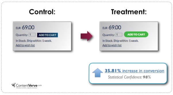
This is a case study by ContentVerve. They managed to increase the sales on their client’s website by 35.81% by merely changing the color of the CTA button to green from blue (on the product landing pages). Mind you, this is sales that we are talking about and not just the number of clicks.
The client was a major European e-commerce company selling hand-painted porcelain.
Takeaway – Do not settle for the generic overall advice that a particular warm or cool color will evoke a specific feeling. You want your CTA to stand out from the rest of the page, and the best way to find how it will stand out is with consistent A/B testing.
Study 3 – Danish mobile exchange website mxchange.dk
ContentVerve tested the font color on the homepage of a client, mxchange.dk – a Danish based mobile exchange website. The hypothesis was that on changing the color of the CTA from black to yellow (on a green background) the number of clicks would increase. It didn’t work.
On changing the font color to yellow from black (on the green colored CTA), the click through rate decreased by 18.01%.
Takeaway – A/B testing efforts need not be successful every time. Failing is also a good thing and is the way forward towards finding solutions. You need to hypothesize and keep trying to optimize your website for maximum conversions.
Study 4 – GSM.nl one of Netherlands’ largest eCommerce website
Visual Website Optimizer ran 3 tests on their client website – GSM.nl. On testing green text links, and then both green and orange “Buy Now” buttons, they found that website engagement increased by 5% using orange buttons.
Image Credits: www.vwo.com
Engagement here means clicking any of the links on the page – which meant a reduction of bounce rate on the website. VWO couldn’t conclude anything about the sales, since there were many variables at play.
Takeaway – A bright color like orange can decrease bounce rate and potentially increase the sales on an ecommerce website.
Study 5– RIFT Apparel
Another VWO client, RIPT Apparel, opted for testing “Add to Cart” buttons. The original button they used on their website blended with the color scheme. So, it was almost invisible.
So, first VWO changed the color of the button to Green. This made the button stand out. Now, this was adopted as a control.
Version A with green add to cart button
The color of the button was changed yet again to yellow to observe results. There was a 6.3% increase in sales in version B vs version A.
Version B – Yellow “add to cart” button that resulted in a 6.3% increase in sales
Takeaway – The color of your buy button should not blend with the color scheme on your product page. Consistent testing with different colors of your “buy now” button can tremendously increase sales.
Note – All the images are courtesy of VWO.
Bonus Study –SAP tests big orange buttons
Wider Funnel made a bunch of tests on SAP’s landing page curtailed under branding guidelines. A large orange download button replaced the earlier text link.
Image Credits – www.widerfunnel.com
This increased the number of conversions by a staggering 32.5% over the control page.
Takeaway – The CTA needs to stand out from the rest of your page. A color should give cues to the visitors to take the action you want them to.
Conclusion
Generalization is far from what we want in this personalized world. Red might be a good color to test urgent CTA buttons on your website and cool colors might relax your users, but don’t indulge blindly in color psychology.
You don’t know the preferences of your audience. You should aim to be finding out what resonates best with your customers. Consistently test your hypothesis. Split testing is the key to optimizing conversions on your website.
Try to highlight the CTA buttons on your website’s product pages by testing contrasting colors. Even minor changes in color can drastically affect (positively or negatively) your conversions, bounce rate, and sales.
———
To learn more color secrets that help sell ideas, messages, products, and services, enroll in the online Udemy course, Life Hack With Color Psychology: Increase Your Influence


Great overview. Most websites uses red buttons to emphasize the importance of the buttons and its content. Is it true that red buttons only applicable to WooCommerce and eCommerce sites only? What’s your take on this?
Thanks for reading the post and your comment Dani. Red color does create urgency and can be the first choice for testing on ecommerce websites. But a generalization cannot be done. It depends on your business audience, their preferences and how the design interacts with other elements on your website. Split testing different colour buttons on your website (eCommerce of otherwise) should be your goal.
I agree with Chintan that it does depend on your audience, what you are selling, etc. I would just also add that it seems that if you can choose a color that is going to stand out from its surroundings, the more noticeable it will be. That said, a little A/B testing never hurt anyone.